Microsoft
Designing for Gen Z: 2024 Back-To-School Campaign
Overview
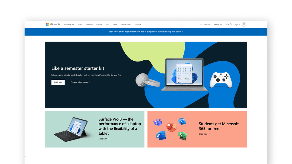
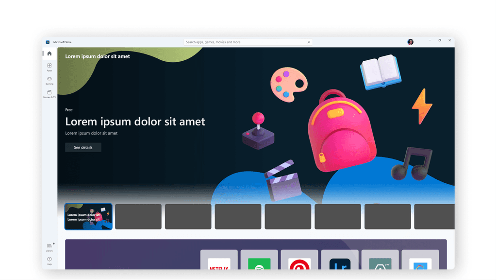
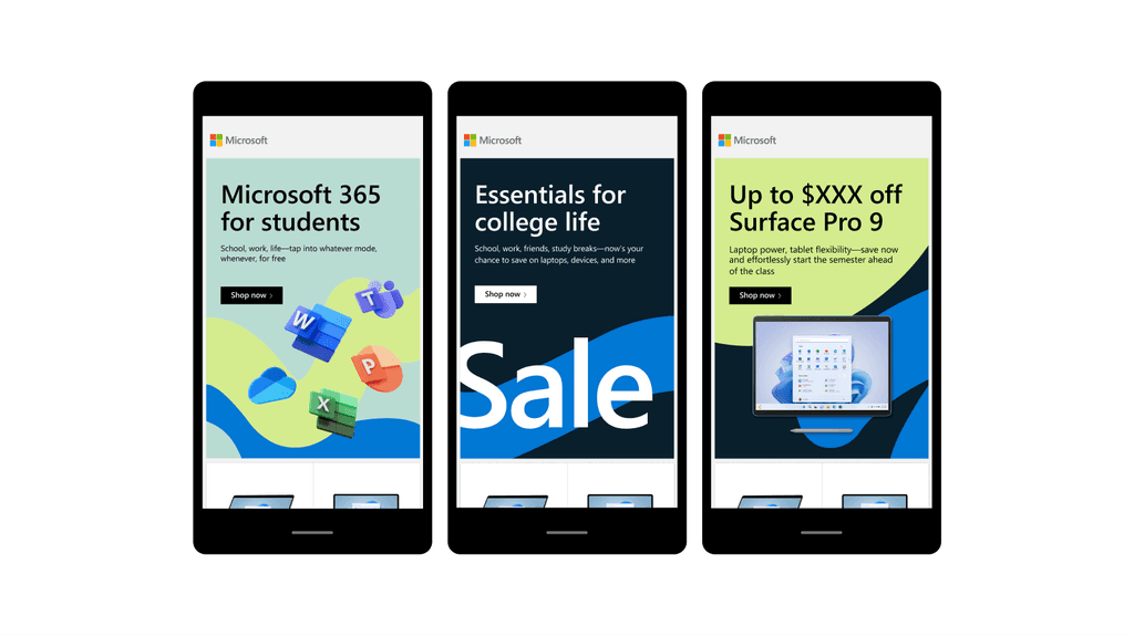
Our creative team developed the visual strategy and assets for Microsoft's Back-to-School campaign. These assets were distributed to cross-channel teams and creative agencies for producing deliverables such as digital ads, social media posts, and emails. A crucial aspect of our work involved creating a comprehensive toolkit—a rulebook guiding users to maintain consistency and quality across all content.
What's on deck?
For the 2024 Back-to-School campaign, we shifted our focus from targeting parents (as in 2023) to Gen Z, specifically college students aged 18-24. For this refreshed campaign, we took what was working from our previous year’s work and spun it to fit the taste of our new primary target audience. Before jumping into designing, we invested time in studying the profile of this emerging consumer base:
- Who is Gen Z?
- What distinguishes them from previous generations?
- What defines their culture?
- How can we make Microsoft "cool" to fit their tastes?
The answers to these questions guided us in making a significant shift from last year's look and feel.
Who the heck is Gen Z, anyway?
The simplest answer is this: it’s the generation of people born between 1997 and 2012. At the time of this Back-to-School campaign, our primary target audience would be ages 18 to 24.
What makes them unique from the past generations? The most obvious answer is that they grew up with technology. This generation grew up playing video games and watching Kids channels through YouTube. They read Google reviews before going into a new restaurant. They share what’s “in-the-know” with friends by scrolling through TikTok. They’re basically digital natives with constant access to information through their mobile devices. This also means that standards and access to choice are at an all-time high. So what can we say about our new customer base is that…
Gen Z’s are confident and independent. With so much accessible information floating around them, they become more open to what’s possible for themselves and the world around them.
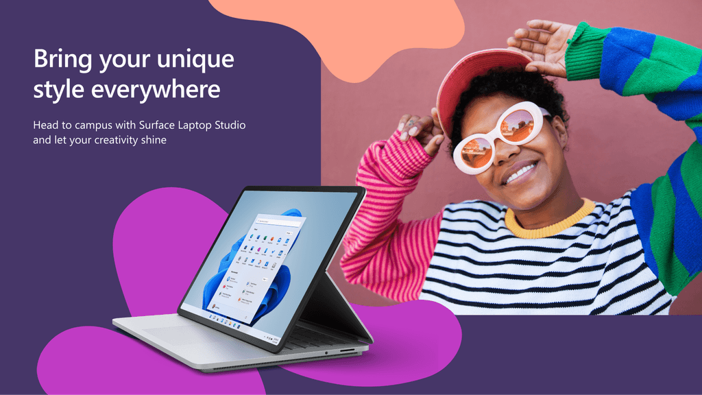
Gen Z’s have dynamic individuality. Let them be radical empaths, little foodies, planet warriors, entrepreneurs. Gen Z resists labels and are happy to deviate from the status quo.
Gen Z is the most diverse and naturally inclusive generation ever. They think bettering society is just as important as bettering themselves.
2024 Approach
Microsoft as a brand needed to step up to win favors of our new customer base. Now, Microsoft design may not be as “cool and cutting edge” as Apple, but Microsoft celebrates what Gen Z finds most value: authenticity and positive human impact.
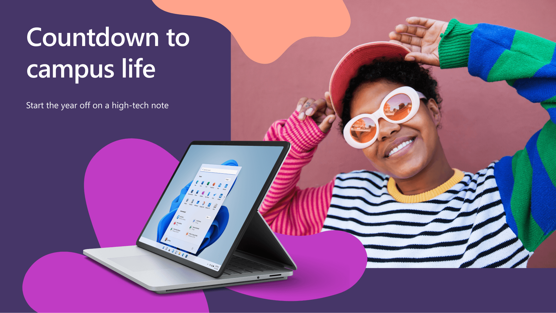
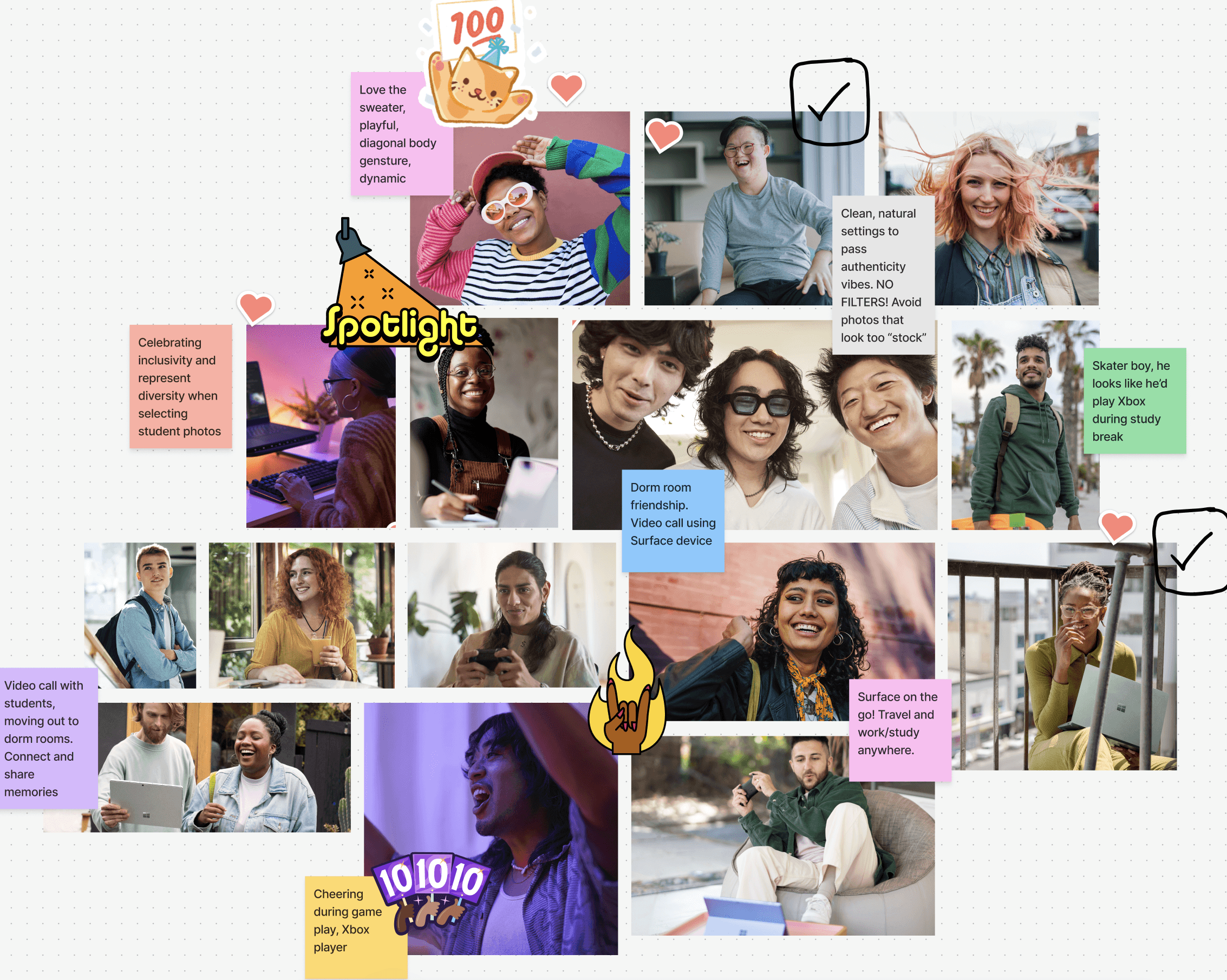
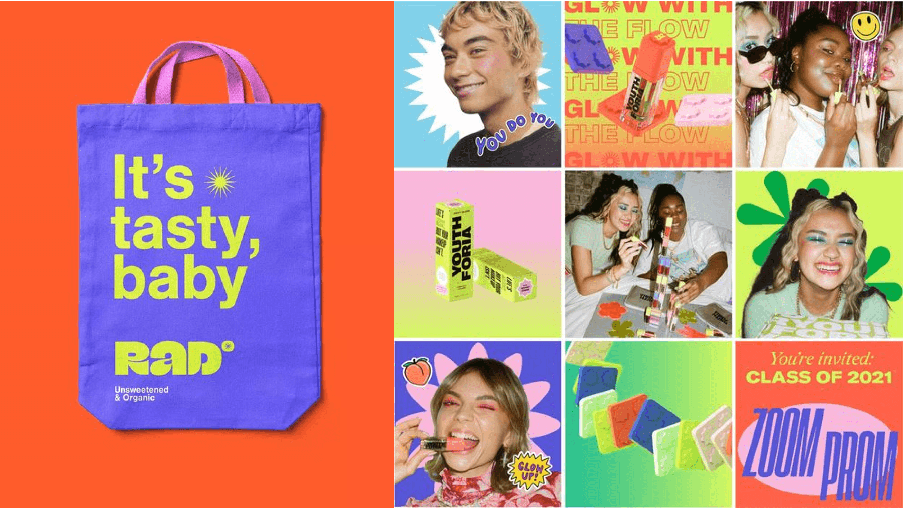
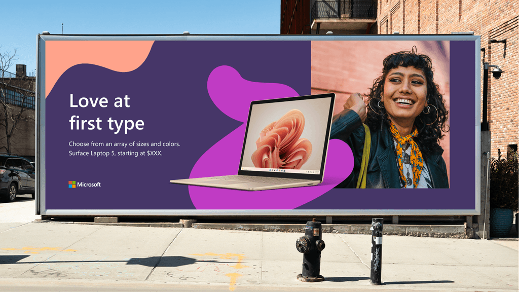
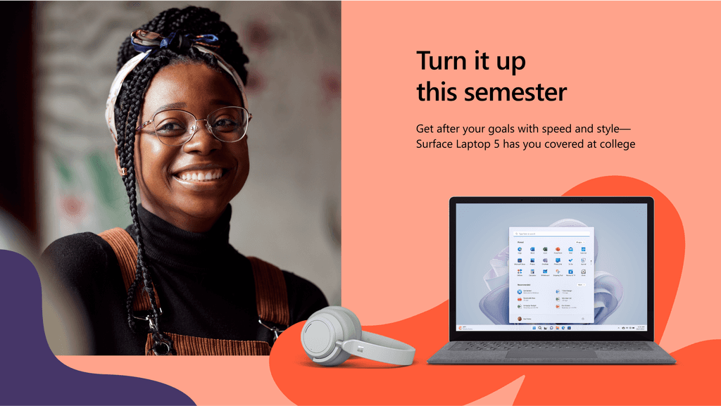
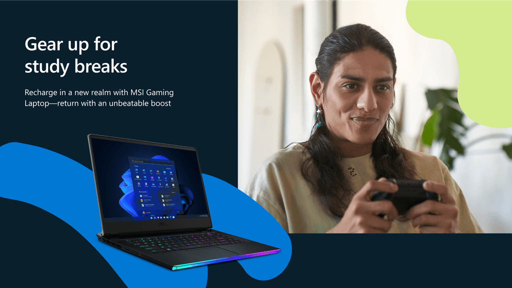
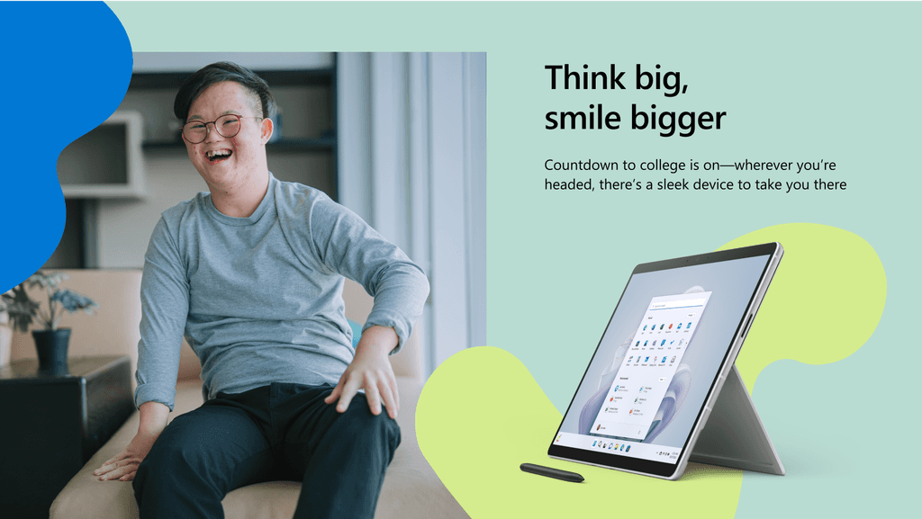
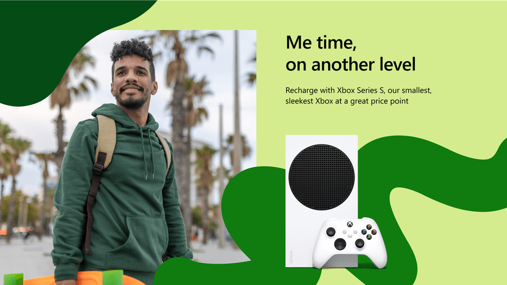
We achieved this through carefully curated photography that evokes human emotions, vibrant moods, and the uniqueness of Gen Z. Each image tells a story that connects with Microsoft's core values and inspires students anticipating the new school year.
Simplifying the System
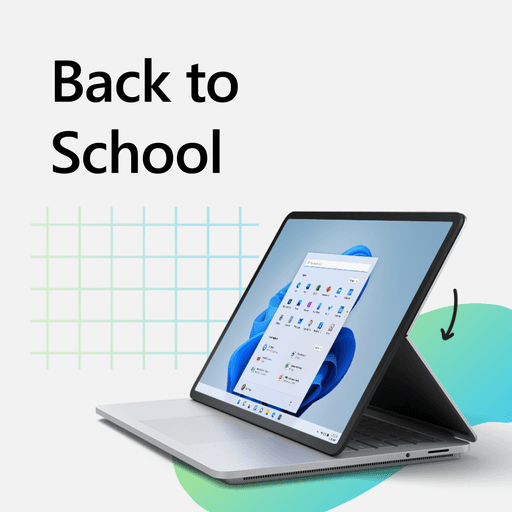
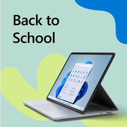
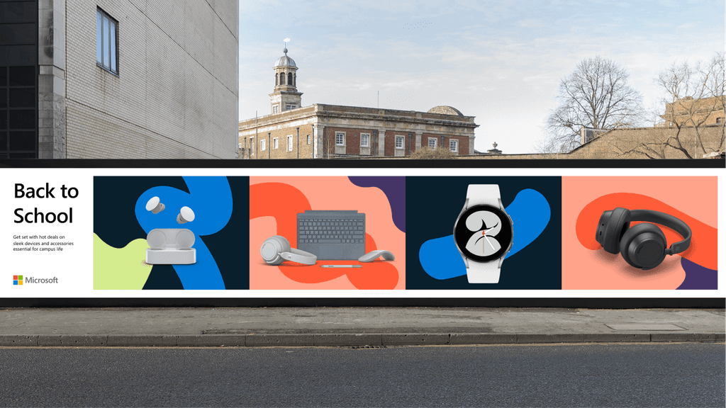
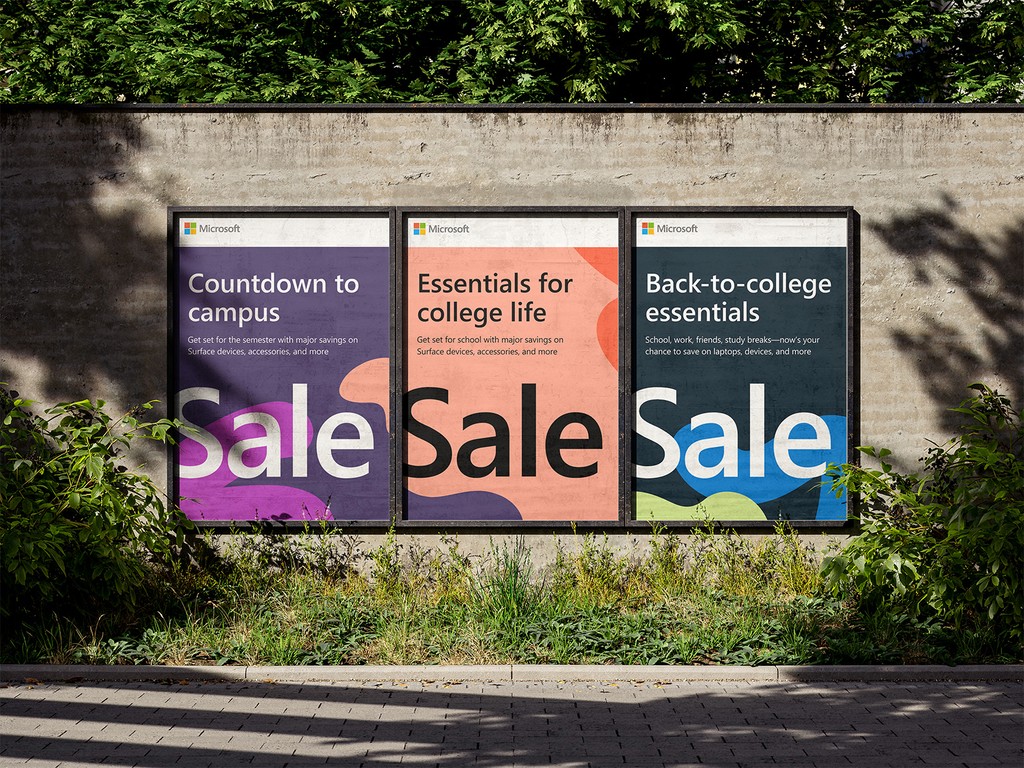
We elevated our concept to appeal to a trendier, tech-savvy audience with a "back-to-college" feel. This meant eliminating elements like graph paper, pencil doodles, and gradients. Instead, we simplified the system by focusing primarily on colors.
Color is Everything
We wanted vibrant, fun, unexpected, and bold. How do we actually achieve that? My personal approach was to push my own boundaries and not be afraid of the colors not working. I’d try something out of my comfort zone to expand my horizon on what colors don’t and do, in fact, work. There were many times where I would have to step away from a color combo and revisit the next day to know that it works. Most importantly, if I wanted fun results, I had to have fun in the process.
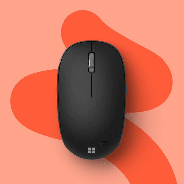
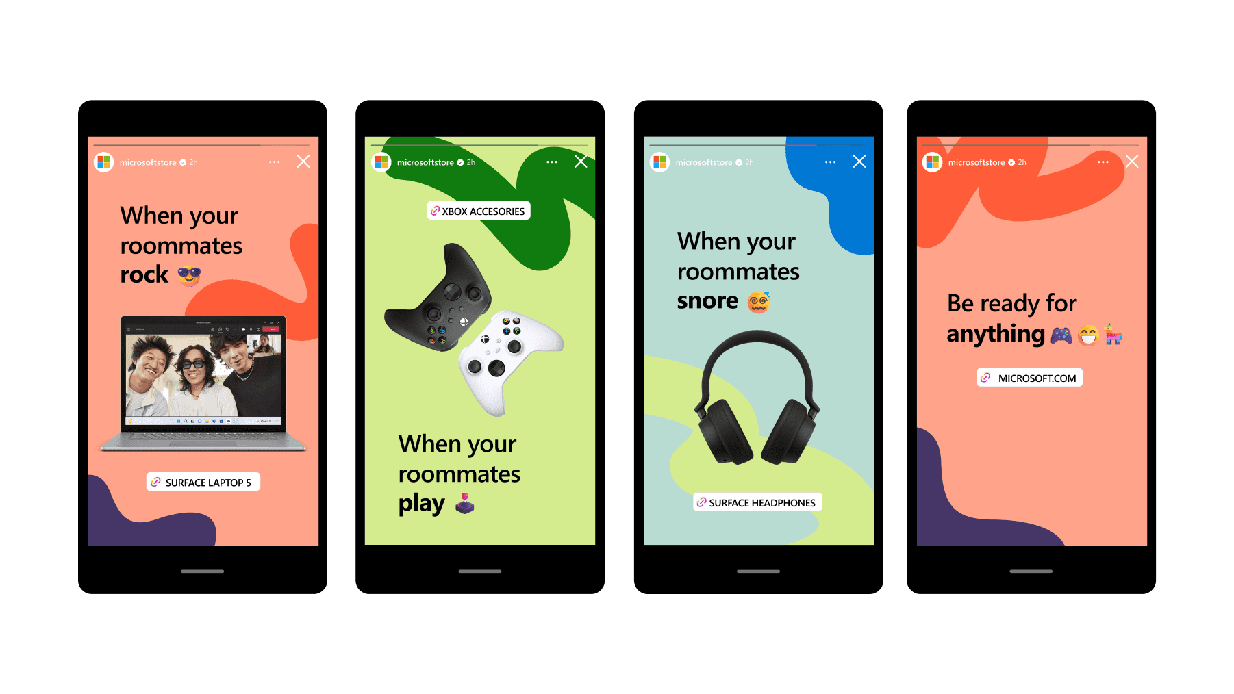
Our winners, orange and magenta, channel the young, and fun energy of Gen Z. To stand with the two extrovert colors, we chose coral to bring balance.
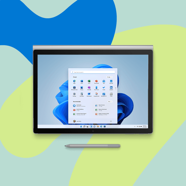
The aqua foam and the pale lime bring in the “chill/quiet study time” vibe, while the brilliant blue emphasizes brand trust with Microsoft products. Note that the bloom UI looks really nice in this color combo!
Moving On from Covid-19
We shifted away from references to Covid-19, hybrid, or virtual learning in our key messaging. Instead, we returned to energetic, fun back-to-school campaign messaging that complements the vibrant colors and inspirational images.
Final Work
Conclusion
I wasn't the only one who really loved how this campaign turned out. The synergy between colors and photography not only created attention-grabbing aesthetics but also strong narratives that aligned with Gen Z's values of authenticity and positive human impact. The simplified yet sophisticated design system was easy for stakeholders to implement. This was an important win for our design team because it meant that we had successfully communicated our intentions in every step of the design process.
Creative Lead: Milena Dedijer
Editorial: Tammy Weisberger, Rebecca Wagner
Project Managers: Tina Muzzy, Peggy Hogge
Design Team: Eunice Choi, Tiberiu Sirbu, Anthony Tschopp, Sara Kaiyala, Moon Kuk

