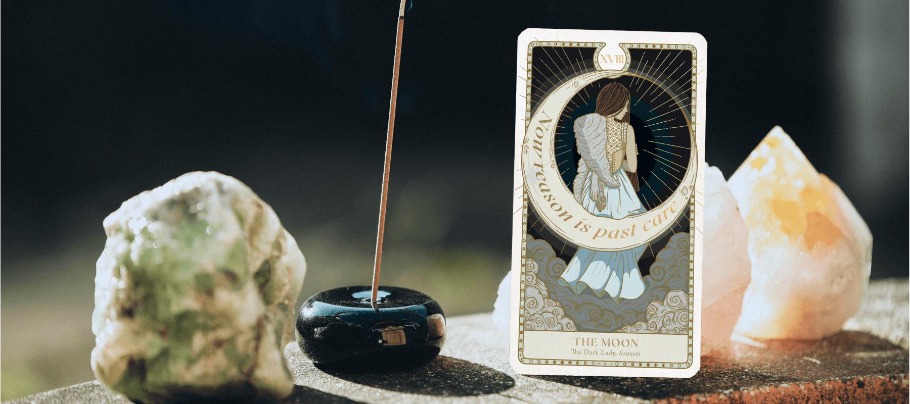
Bard's Arcana
Illustration & Branding for Shakespeare-themed Tarot
Overview
In 2021, Greg, a New York-based storyteller, approached me with a brilliant idea, “Let’s create a Shakespeare-themed tarot deck!” I immediately jumped in, excited to take on this project, which would become Bard’s Arcana: The Tarot of Shakespeare.
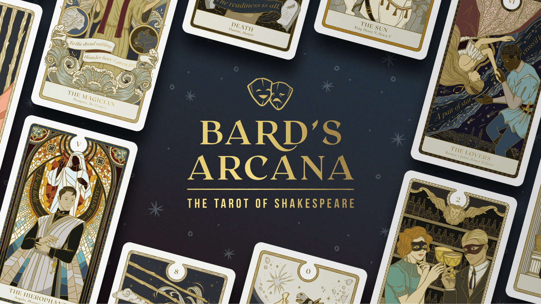
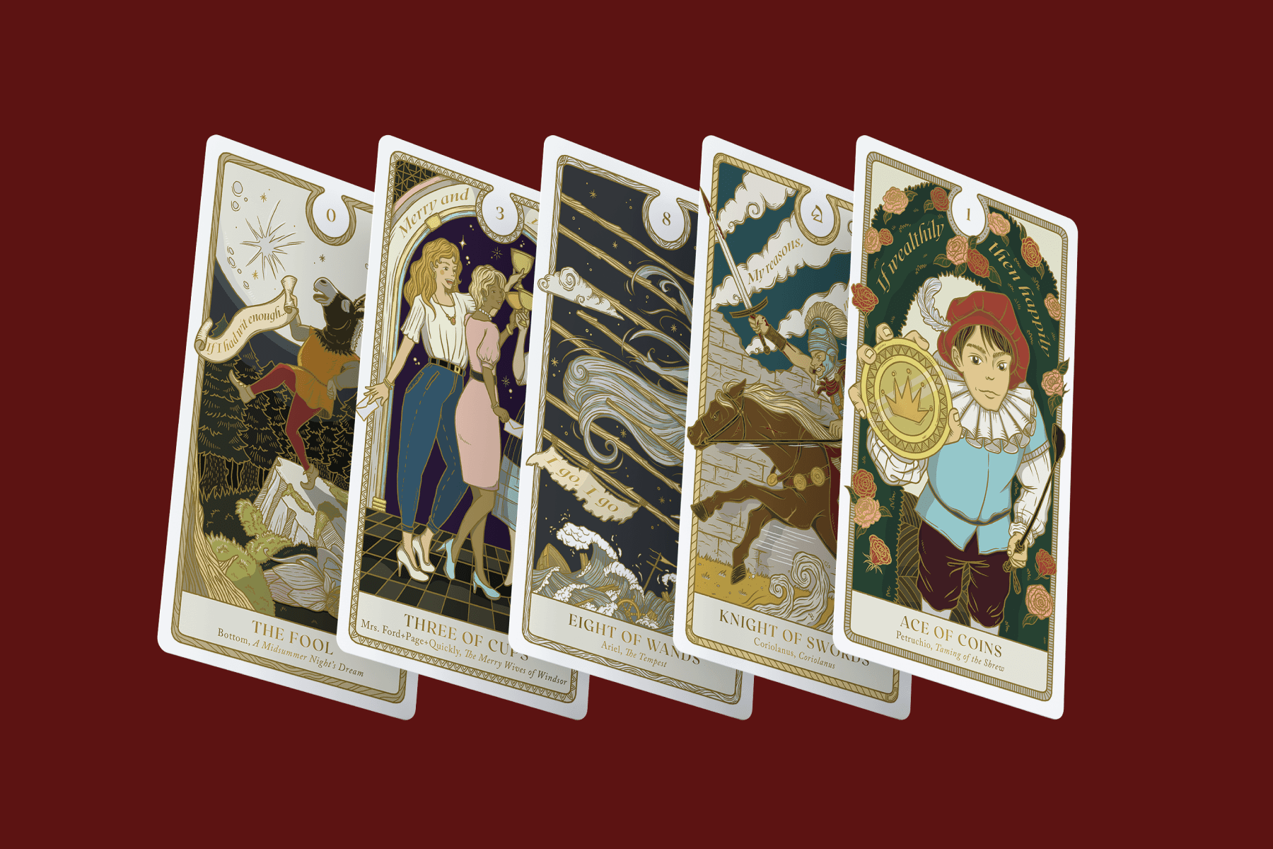
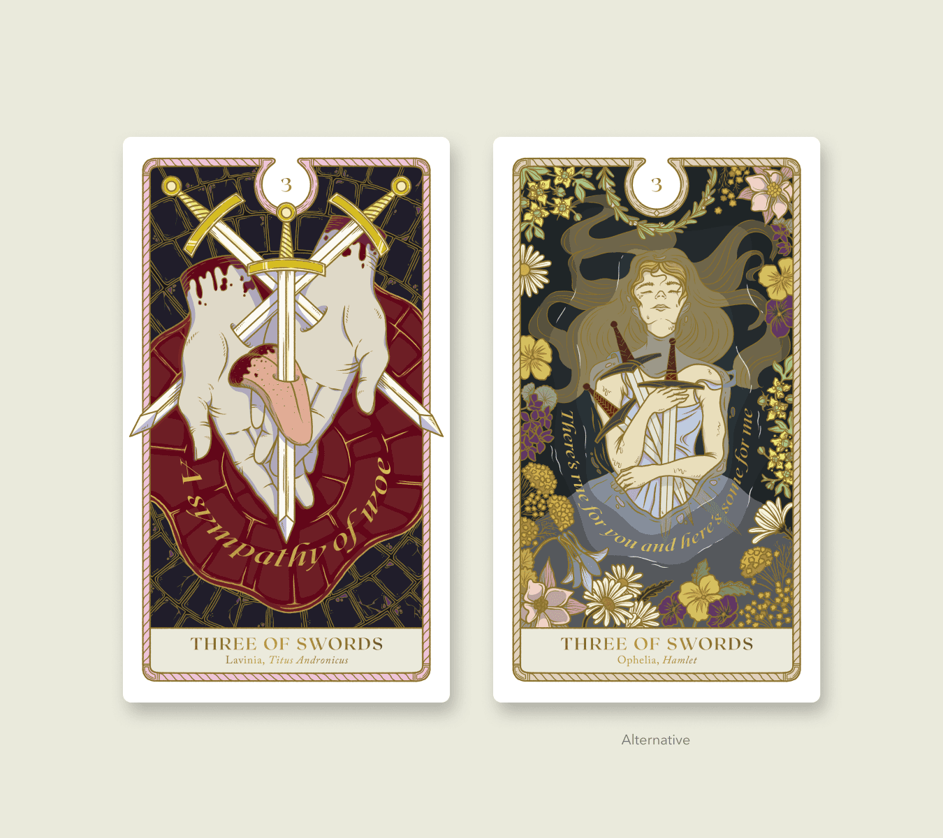
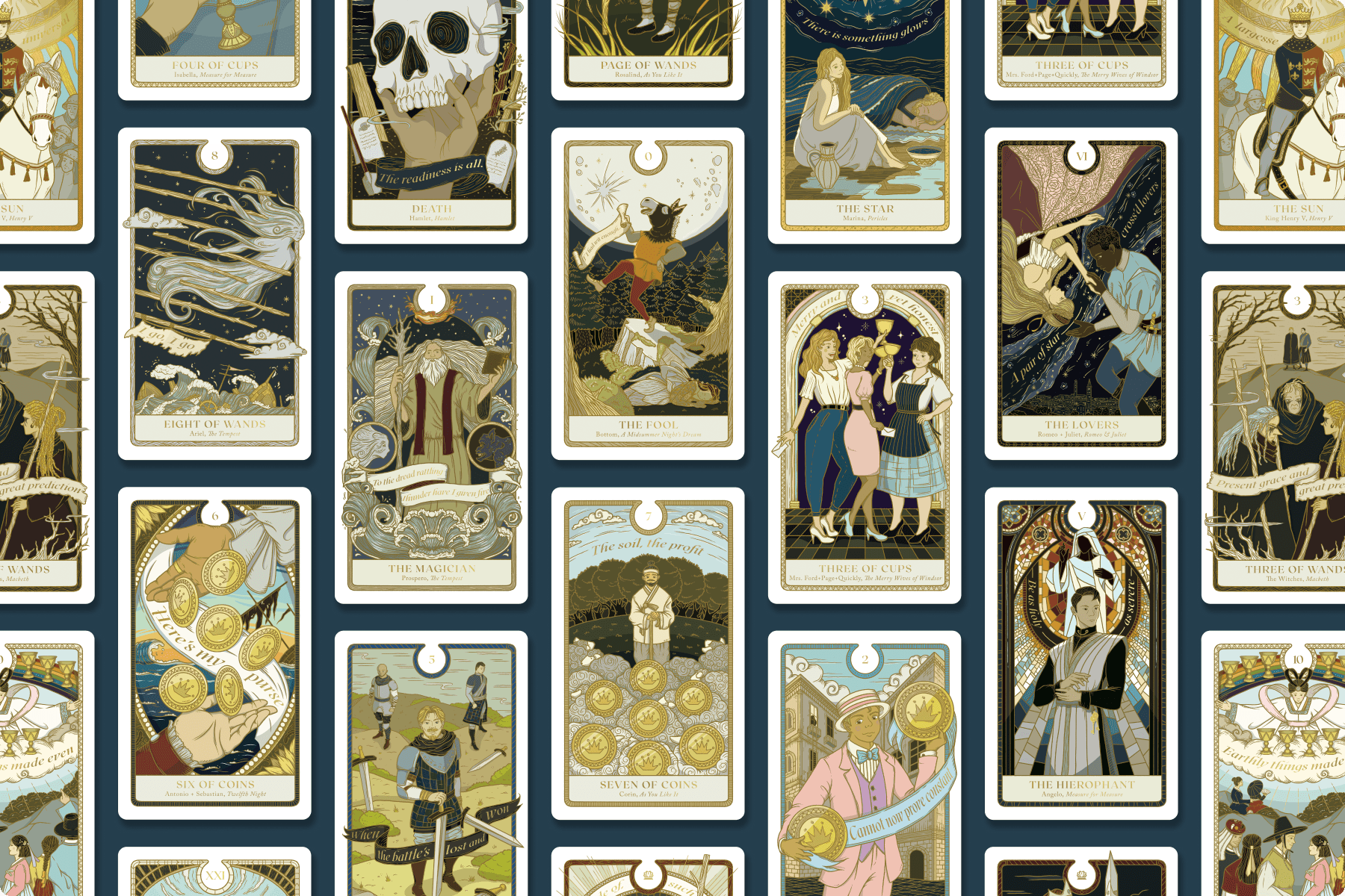
Bard’s Arcana is a full tarot deck with 78+ illustrations merged with Shakespearean narratives and the mystical world of tarot. I was surprised to learn how much overlap there is between the two. “The writings of William Shakespeare and the images of A.E. Waite and Pamela Coleman Smith's Tarot offer two of the most evocative, enduring, and intuitive symbol systems in European history,” Greg mentioned, “Each body of work presents its own pathways towards a deeper understanding of ourselves, each other, and what it means to be human in this world.” Bard’s Arcana is truly a piece of combined art that gives a vivid, grounded form to tarot’s abstract archetypes through Shakespearean characters and scenes.
Scope of Work
PRODUCT
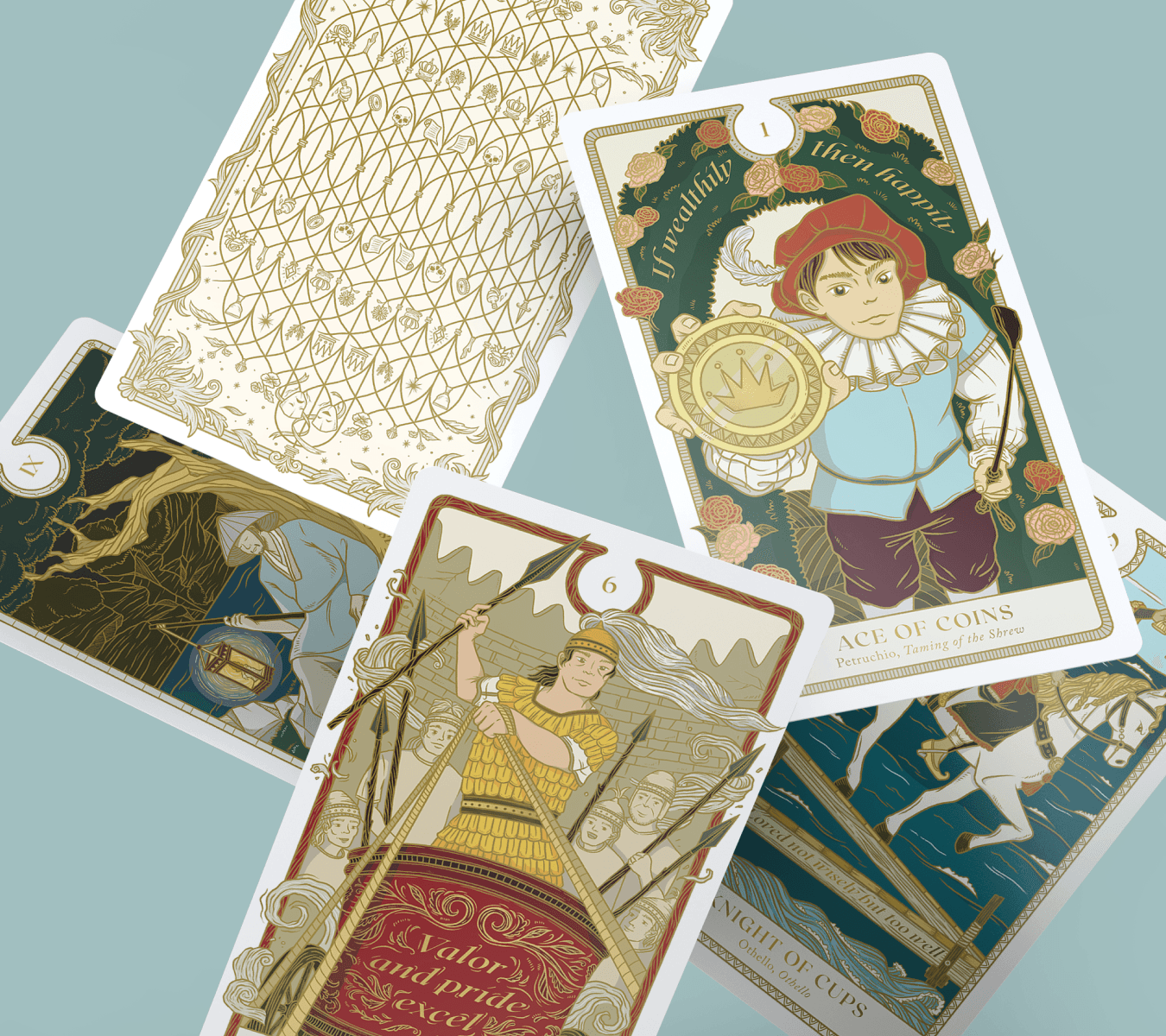
78+ card illustration
Brand identity
Guidebook and package design
KICKSTARTER
Product page on platform
Data visualization
Pledged items
SOCIAL MEDIA & OUTREACH
Instagram content
Pitch presentation deck
Creative Process
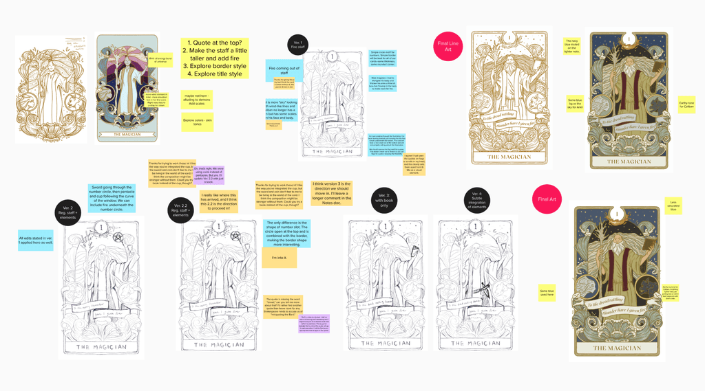
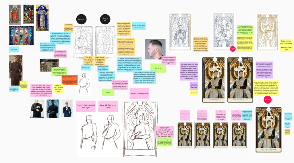
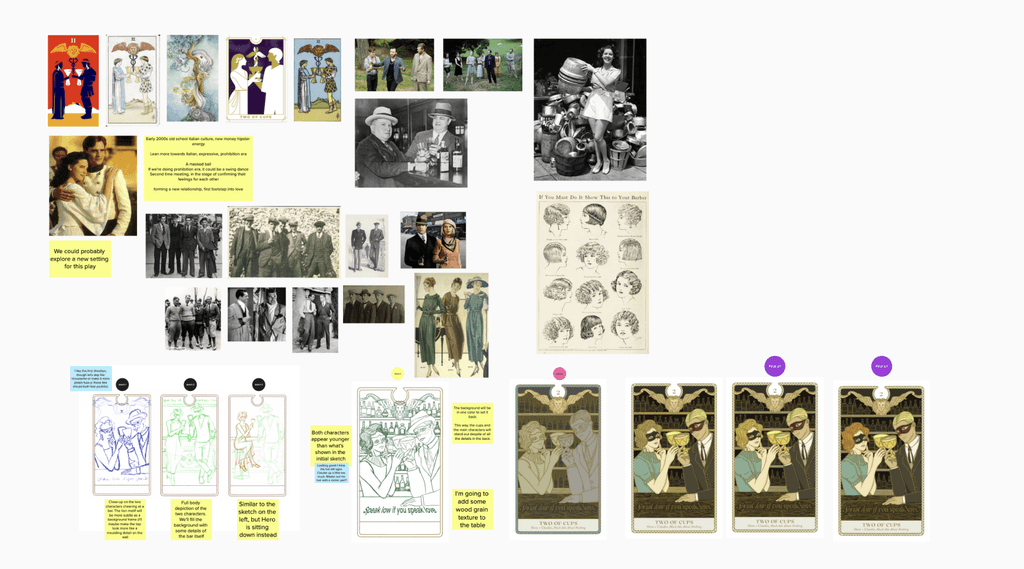
From start to finish, the entire creative process was highly collaborative. Greg had already assigned a character and quote to each tarot card. I set up a digital space where we could brainstorm. For each card, we pulled reference images from adaptations, pasted excerpts from the plays, and wrote sticky notes with suggestions. We debated settings, like which time period our version of “Much Ado About Nothing” should be in, and explored “crazy ideas” that later turned out to be the best.
I shared progress at every stage, from rough sketches to final illustrations. For each card, I experimented with different poses, compositions, and costume designs, refining the ideas as we went.
Branding Bard's Arcana
Typography
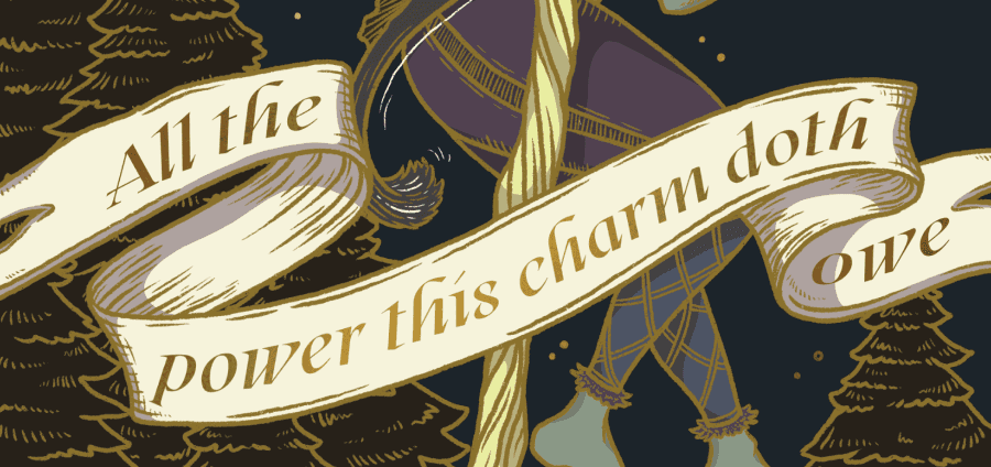
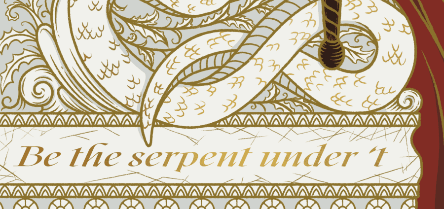
The typeface, Roxborough, is modern, elegant, and classical. Little details, like the descender on the letter “R” that swoops underneath the letter “D,” feel very charming. The italic version works especially well for the quotes on the cards, often written in scroll-like banners reminiscent of the Elizabethan era. To me, the typeface has this quaint quality that bridges a historical and contemporary feel, a perfect fit for Bard’s Arcana.
Color Palette
While exploring color palette ideas, I was drawn to the rich, earthy tones found in Elizabethan art and textile designs. I wanted to capture that same sophistication, while adding my own twist with pops of vibrant color in the illustrations. This foundation for our color palette became the cornerstone of the selection process across all the artwork.
Icon Designs
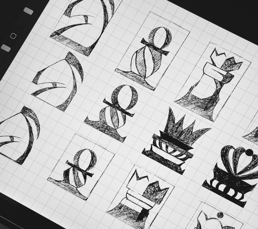
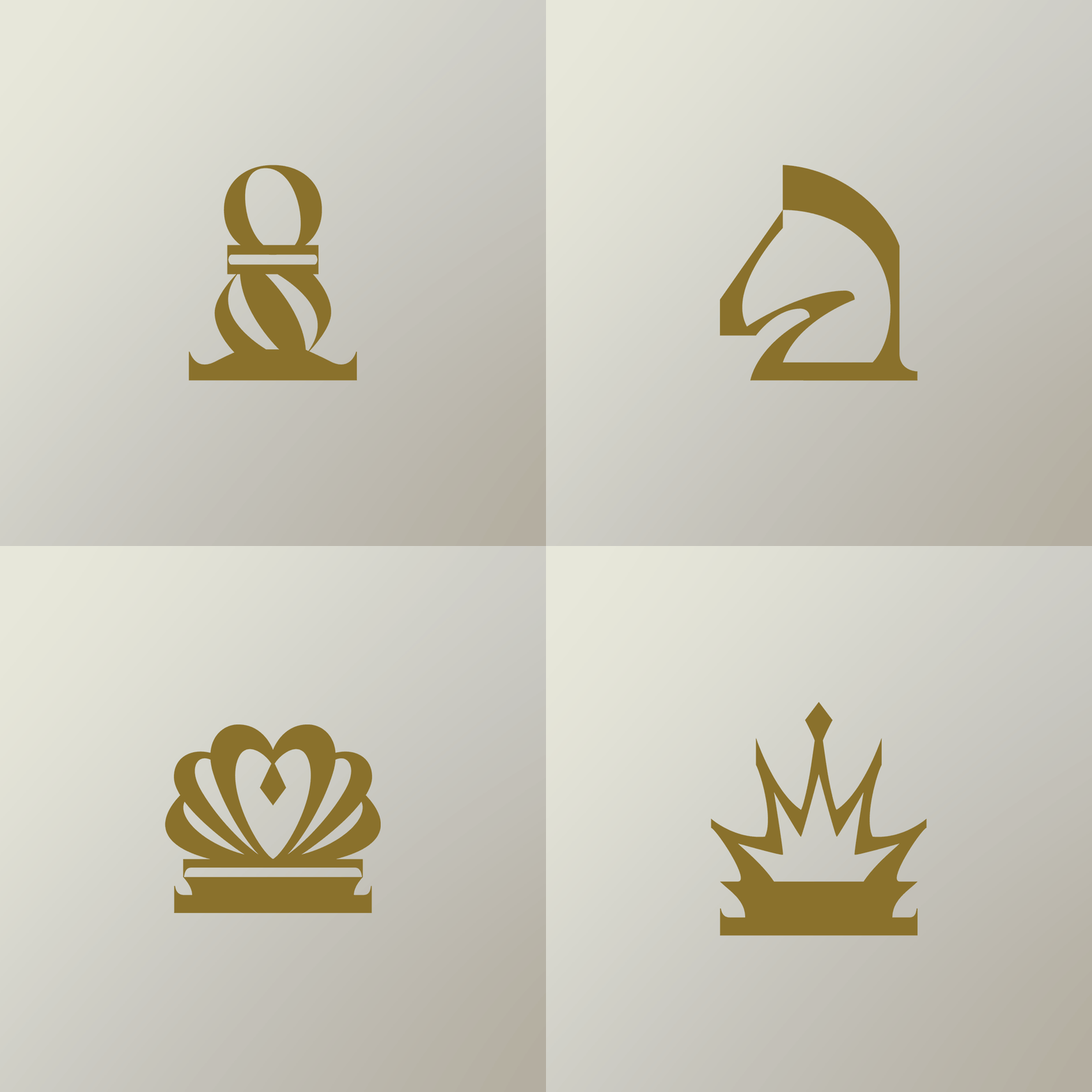
The Major Arcana cards feature Roman numerals, like the Rider-Waite deck, while the Minor Arcana uses Arabic numerals and custom icons that look like chess pieces. Our typeface, Roxborough, has a tapering look that feels very elegant. I wanted to carry that element into the icons to make them feel like they’re part of the font family.
Final Work
Kickstarter & Outreach
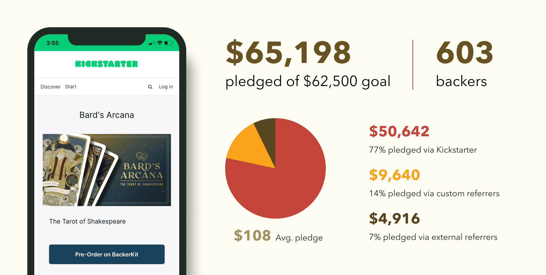
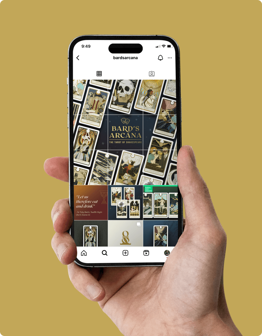
In December 2022, we launched a Kickstarter campaign to fund printing and distribution. The response was incredible! Bard’s Arcana attracted over 600 backers and raised more than $65k, with an average pledge of $108. I also created social media content to promote our Kickstarter and raise awareness of this exciting project.
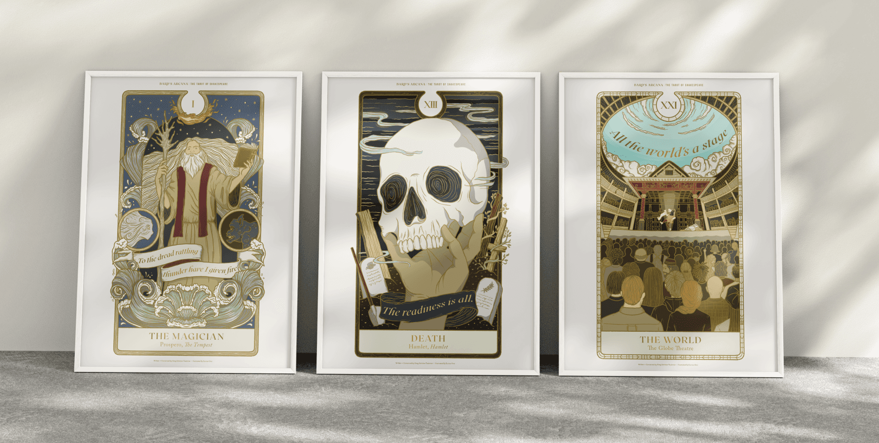
Some backers will receive 11x17 art posters as part of their rewards.
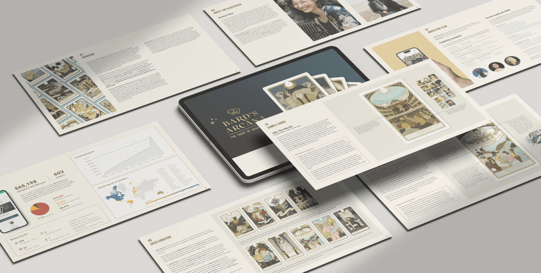
I also put together a presentation to pitch Bard’s Arcana to larger publishing companies.
The Journey Continues…
We are now in the production phase, working with a print vendor to bring Bard’s Arcana to life. Greg and I have poured our hearts into this project, and I can’t wait to hold the physical deck in my hands!
Project written and conceived by Greg Schicker-Taubman

